black is for grownups
July 25, 2007
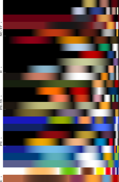
Armin Vit investigates color trends in popular movie posters (via information aesthetics). When I first skimmed the article (skipping the words to look at the pictures), I assumed the author had written a program to look at each pixel and graph the color frequency; however, upon reading the text, I learned that this intrepid designer had created the frequency graphs by hand based on his impression of dominant colors, which is arguably a more accurate approach. (Is there any truly great designer who is not obsessive?)
“…a movie’s theatrical poster is only a very small part of the larger marketing and hype machine that turns movies into spectacular blockbusters, but as part of a whole, they are fairly representative of the “image” of any given movie. So, as an exercise in color trends, and to see if any significant pattern emerged, I decided to break down the colors of 25 posters — the top 5 of each MPAA category.”
“it is nonetheless telling that black is the color of choice in movie posters. Chalk it up to contrast if you want, but also don’t forget how many of our clients are afraid of using black, as they usually deem it scary, gloomy, heavy or depressing — and people that wear black are either mourning or designers caught in a time warp of the 1980s”
